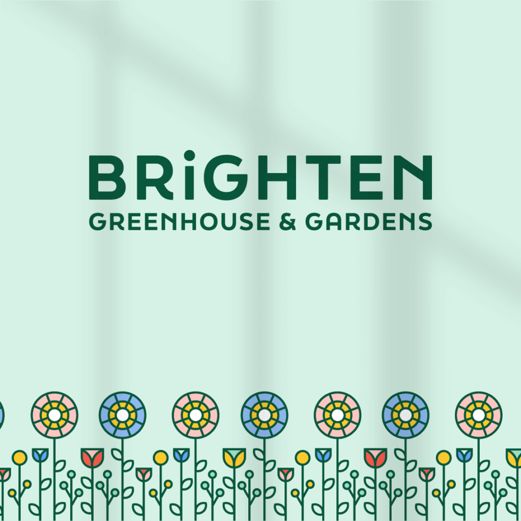
A fictional greenhouse grown and fresh cut floral shop.
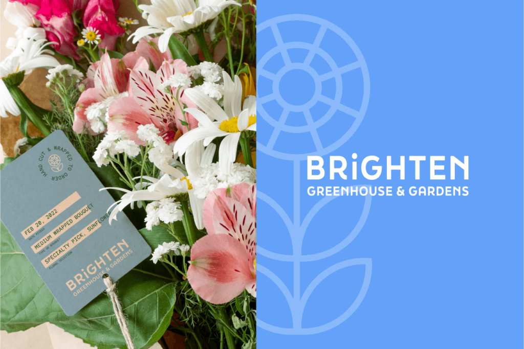
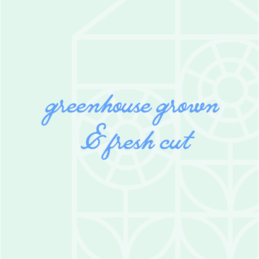
Brighten believes that getting locally grown flowers that bloom in their respective season is the freshest, and most economical way to make the florals the centerpiece of your home, wedding, or special occasion.
THE PROBLEM
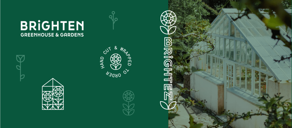
Brighten needed to feel different, because they are different. The goal of the brand identity was to showcase that the flowers are grown inside of a greenhouse, while feeling fresh and inviting.
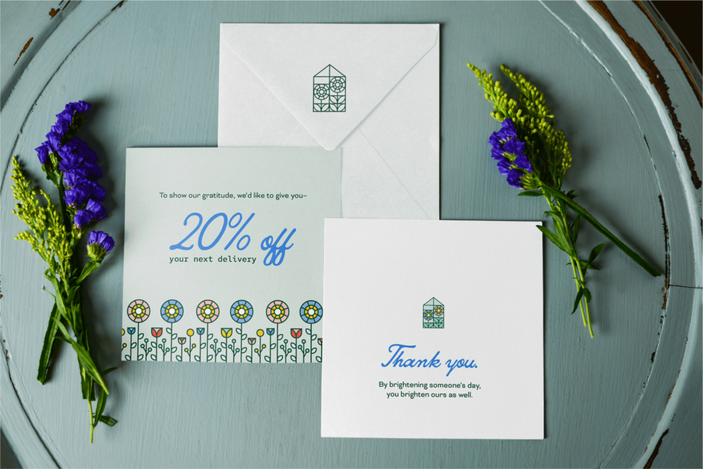
Brighten wanted to feel like your floral partner when you have an event, your floral friend when you’re buying a bouquet for a loved one, and a floral experience that you can visit and enjoy as you walk around and see all of the blooms.
We needed to create something fresh and full of life in order to show that Brighten is the place to go when you want an experience and product that equates to the love you have for the person you are buying for.
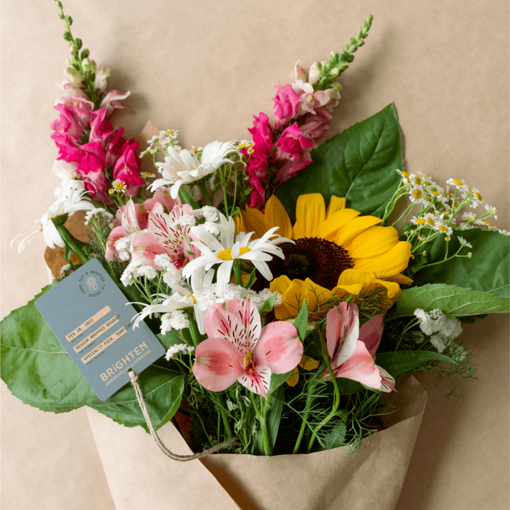
THE RESULT
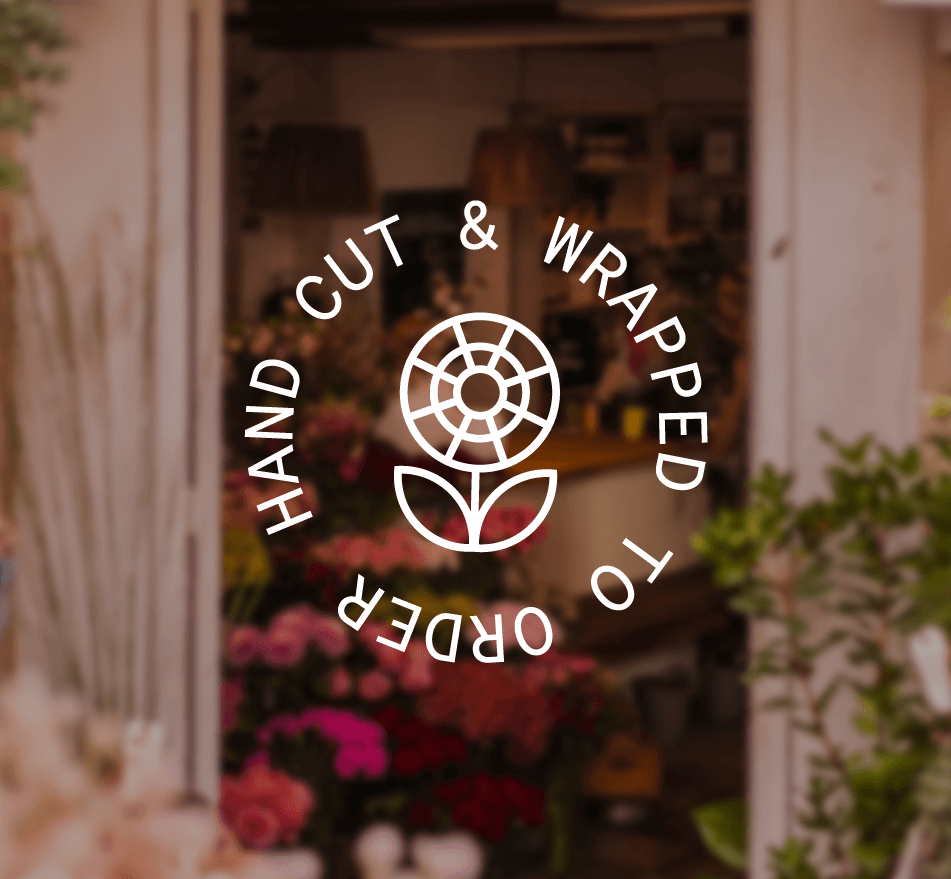
A geometric logo that shows bright flowers growing inside of a greenhouse. This approach was rooted in the concept of showing the greenhouse in a simplistic way, and not being too illustrative or curvilinear, like their competitors.
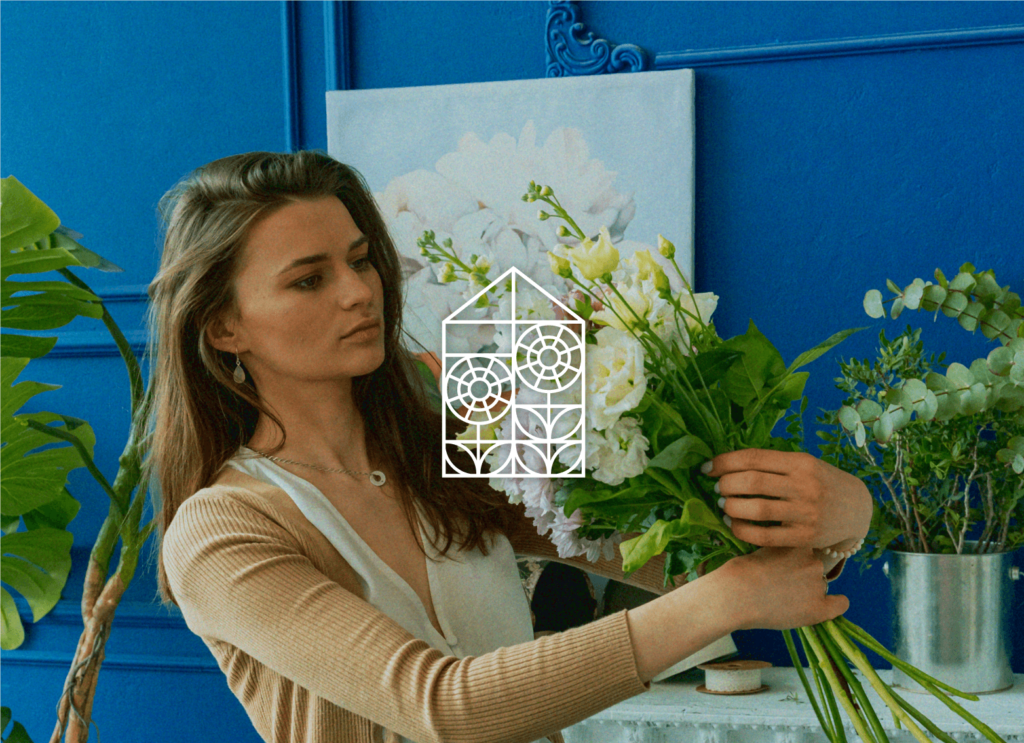
Brighten isn’t selling the “luxury” flowers. They are selling homegrown and hand cut flowers. We needed to feel like a modern take on grandma’s garden in order for the consumer to feel the comfort and joy.
Like what you see?
Let’s do it for you and your business! Head over to our contact page and inquire to get on our books. We are typically booked 1-2 months in advance.